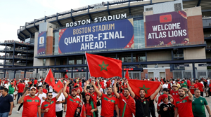
The roar of the crowd defines the Africa Cup of Nations (AFCON), the bright colours of the stadium, and the unmistakable image of national team jerseys. Morocco’s AFCON record is closely tied to the iconic kit designs worn by the Atlas Lions, a nation with a rich footballing heritage. These jerseys are more than just sportswear; they are symbols of national pride, historical moments, and the changing identity of Moroccan football. From the simple, classic designs of the early tournaments to the technologically advanced and artistically intricate uniforms of today, every strip tells a story of triumph, challenge, and enduring passion.
This journey through Morocco’s kit evolution will take us through the journey of these jerseys, highlighting the significant designs that have graced the pitches of Africa. We will look at how manufacturers, trends, and national identity have influenced the look of the Atlas Lions, making each piece a memorable testament to their storied campaign in Africa’s premier football competition.
Morocco AFCON Kits & National Colours 2023: The Building Blocks
For Morocco’s first forays at the Africa Cup of Nations, kits were, for the most part, functional and plain in line with the fashion of the time for football apparel. From the very beginning, the basic colours of red and green, taken from the national flag, were established and have remained constant throughout their history. Red was usually the dominant home colour—a symbol of bravery and strength—and green, representing hope and prosperity, was often used as an accent or alternative away colour.
In these first years, designs were simple, plain red shirts (often with a white collar or trim), white shorts, and socks. If there was a national crest, it was generally a simple stitch. These initial kits set the stage for the more intricate designs that came later, establishing the identity that fans know and love today.
Golden Era: Kit of 1976 AFCON Champions
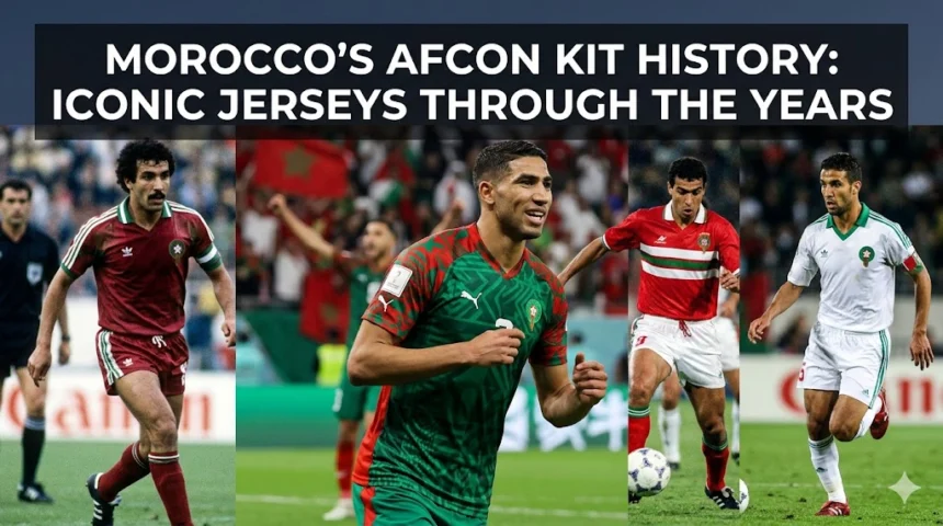
1976 is a special year for Moroccan football because it is the only time they won the AFCON. The team wore perhaps one of the most iconic kits in the nation’s footballing heritage during this historic campaign. Famously, in 1976, the team broke with tradition and lifted the trophy wearing mainly green jerseys, a bold departure from the traditional red that has since become synonymous with their greatest achievement.
This green band, usually paired with green shorts and socks, had subtle white details, perhaps on the collar or cuffs. It was a nod to the days when national teams would occasionally play about with their primary colours for certain tournaments. It was a simple design that somehow managed to look extremely successful in its wearability. The 1976 green jersey is the golden generation, a period of unrivalled glory for Moroccan football, which is brought to life in The Golden Generation: Morocco’s 1976 AFCON Triumph Explained.
The green uniform is what people remember most, but Morocco also had a traditional red option during the tournament, likely as an away option. Supporters are very fond of both iterations of the 1976 designs, and they represent success and a close connection to their footballing heritage.
1980s—Evolution and Greater Brand Presence
Design gradually evolved in the 1980s. As football became more commercialised around the world, kit manufacturers started to play a more prominent role. Jerseys also began to feature more distinctive elements than solid colours, but still modest by today’s standards.

The red home option was dominant and featured neck-red-necks or polc, which were popular at the time. White or green trim was used more often, subtly breaking up the main colour. Away kits tended to go the other way, with white or green being the main colour. Logos of early kit suppliers, perhaps not global giants at the time, started to appear, adding a new dimension to the uniforms.
Morocco’s strong performances in the mid to late 1980s, including reaching the semi-finals, helped the jerseys become associated with a period of consistent competitiveness for the Atlas Lions and put them on a prominent stage. The designs of the decade reflected a move away from simple utility and a budding awareness of football fashion.
1990s: Daring Designs and Worldwide Partnerships
The 1990s were a fun era for football kits around the world, with more daring designs, geometric patterns, and the emergence of big global sportswear companies. The AFCON kits of Morocco from this era certainly did the same, becoming more eye-catching and memorable.
Most home options stuck with the traditional red, but designers played with myriad patterns, often including subtle stripes, jacquard weaves, or abstract motifs within the fabric. Collars became more elaborate, sometimes in contrasting colours or special shapes. The crest of the Royal Moroccan Football Federation (FRMF) was a more prominent feature, often in greater detail.
Away uniforms were even more creative, usually using white or green as a base and sometimes with elaborate red or green patterns. This decade, Morocco also struck deals with global sportswear brands like Adidas and Lotto, which infused their own design philosophies and state-of-the-art materials into the Atlas Lions’ jerseys. The partnerships brought these designs to global attention at a time when they recorded some of their best AFCON performances since their 1976 win, cementing these kits in fans’ minds.
The New Millennium: Adidas, Puma, and Contemporary Aesthetics
At the turn of the millennium, an era of increased professionalism and technological development in kit design began. Morocco’s uniforms in the 2000s embodied this transition, with a focus on performance, comfort, and a sleeker aesthetic.

The 2004 Finalist Kit: Early 2000’s
One of the most memorable jerseys of the early 2000s was worn during the 2004 AFCON, in which Morocco reached the final. Usually made by Adidas, this had a clean, classic red design for the home strip, often with white accenting on the shoulders or sides. The away choice was mostly white, following the national colour scheme.
That 2004 kit became synonymous with a powerful Moroccan side that mesmerised the continent. The design was fairly understated and didn’t take away from the team’s performance, and despite the loss at the end, it became a lasting favourite
Mid-2000s: Focus on Performance
As the decade went on, companies such as Adidas and, later, Puma focused on material technology and ergonomic design. The uniforms of the mid-2000s were often made of breathable fabrics and incorporated mesh panels and designs intended to increase player comfort and performance in the often-hot African conditions. Design-wise, they moved to more muted patterns or textured fabrics, allowing the iconic red and green to take centre stage.
Slight Refinements: 2000s
At the end of the decade, the jerseys continued to evolve with minor refinements. Collars became less important, often just crew necks or shallow V-necks. The national crest was generally heat-pressed or lightweight, and manufacturer logos were incorporated seamlessly. The focus was on a modern athletic silhouette with a clear reverence to the traditional colour palette of Morocco.
2010s: Innovation and tradition
Kit designers in the 2010s increasingly looked to combine contemporary innovation with elements of national heritage and identity. For Morocco, that meant weaving subtle cultural motifs into cutting-edge sportswear technology.
Early 2010s: Signature Details
Supplied uniforms from the early part of the decade featured more distinctive details from Puma. They might have special collar patterns, contrasting stitching, or subtle graphic designs inspired by Moroccan art and architecture. The primary red home design emphasises a dynamic, athletic silhouette. The away jerseys kept flipping back and forth between white and green, sometimes with eye-popping red accents.
Mid-2010s: Focus on National Symbols
As the decade progressed, there was a clear tendency to incorporate national symbols explicitly. The FRMF crest was always there, but some designs might have featured subtle fabric patterns inspired by traditional Moroccan tilework (zellige) or other cultural motifs. The green away option was more prominent at times, perhaps a nod to the 1976 triumph, or a strong alternative to the dominant red.
late 2010s: Revisions on Classics
Towards the end of the 2010s, designers were often looking to the past for inspiration, reinterpreting classic elements with a modern twist. This might be a shift to more straightforward collar designs with state-of-the-art fabric tech, or a pared-back look that really lets that bright red and green shine. The idea was to make these pieces both timeless and contemporary, appealing to longtime supporters and a new generation of fans.
Modern Era: Worldwide recognition and Puma’s dominance
The Atlas Lions have partnered with Puma in the last few AFCON tournaments, wearing shirts that are globally recognised for their quality and design. Today, we see a more nuanced approach that blends performance fabrics with style and a subtle nod to culture.
Today’s home jerseys are mostly red, often featuring detailed designs, either printed or woven into the fabric. Often, they draw inspiration from Moroccan mosaics, geometric patterns, or traditional symbols, which give a particular cultural richness to the work. The crest is generally a premium lightweight application, and the Puma logo is seamlessly incorporated.
Away kits also vary, with white and green being the primary alternatives. The newer green kits have been especially popular, perhaps because of their connection with the winning year of 1976, perhaps because of their bright good looks. The jerseys ardesigned e not only twithstandve thrigoursrs of AFCON but also to be stylish anrecognisablele on the world stage, especially after Morocco’s impressive performances in recent years, thanks to legendary players who shaped Morocco’s AFCON journey.
The materials are ultra-lightweight, moisture-wicking, and designed for maximum breathability, which is essential when playing in varied African climates. Modern designs are a perfect blend of heritage, performance, and contemporary looks, reflecting the spirit of a team that is always pushing the envelope.
Signature Elements & Lasting Legacy
What really makes Morocco’s AFCON kits stand out, beyond the unique styles of each period, is a set of signature elements that have always contributed to their enduring legacy.
The Red and the Green
The basic and unchanging feature is the use of red and green. Red is the dominant colour of the national flag and the primary home colour, signifying the nation’s struggle for independence, bravery, and strength. The colour of Islam, hope, and prosperity is green, always present as an accent, trim, or in the away or third options. This uniform colour scheme gives instant recognition and a strong national tie-in.
Symbol: Logo of the Royal Moroccan Football Federation (FRMF)
Every item bears the crest of the Royal Moroccan Football Federation, which has evolved over the years but remains the central identifier. Its design has been modernised, but it always has elements that signify Moroccan identity, often a star, a crown, and traditional motifs. The crest is the core of the jersey, representing Morocco’s football governing body and national team.
Partnerships with Manufacturers
Morocco has partnered with several sportswear brands over the years, each putting its own spin on the designs. From humble beginnings with less prominent suppliers to household names like Adidas, Lotto, and Puma, these partnerships have brought a variety of design philosophies, technological advances, and marketing reach to the Atlas Lions’ kits. These partnerships are a sign of the growing commercial value and international appeal of Moroccan football.
Résumé
Morocco’s AFCON uniform history is a colourful cloth woven from threads of national pride, sporting ambition, and changing design trends. Each jersey, from the simple green of the champions of 1976 to the technologically sophisticated and culturally rich jerseys of today, tells a story in the Atlas Lions’ journey through Africa’s most prestigious tournament. These uniforms are not just costumes; they are treasured symbols that evoke legendary players, epic matches, and moments of collective joy and heartbreak.
As Morocco continues to compete on the contest stage, its design undoubtedly evolves, reflecting trends while always staying true to the iconic red and green that embody the spirit of the nation. The legacy is a testament to the unwavering passion for football in the Kingdom and to its rich contribution to Morocco’s Africa Cup of Nations record.
Morocco AFCON Kits FAQ
What are the primary colours of the Morocco AFCON kits?
The main colours are red and green, taken straight from the national flag. Red is the traditional home choice, signifying bravery and strength, while green is usually used as an accent or for away/third choices, which symbolise hope and prosperity.
What is the most iconic AFCON kit of all time?
Perhaps the most iconic piece is the mostly green jersey worn during Morocco’s victorious 1976 AFCON campaign. This strip is forever associated with the country’s only Africa Cup of Nations title.
Are Morocco’s AFCON kits always red?
Red has been the primary home colour throughout Morocco’s history, but they famously wore green for their 1976 AFCON win. Away uniforms have often been green or white, too.
Morocco’s AFCON jerseys: which brands have supplied them?
In recent decades, Morocco’s kits have been made by several leading sportswear companies, including Adidas, Lotto, and, most recently, Puma. These collaborations have introduced different design philosophies and technological advancements to the jerseys.
How have Morocco’s AFCON kit designs changed over the years?
Early designs were simple and practical; the 1990s introduced more ornate and patterned designs, while the new millennium brought technologically advanced, performance-enhancing uniforms. The new designs include subtle cultural designs and intricate patterns,s but still use the traditional red and green colours.